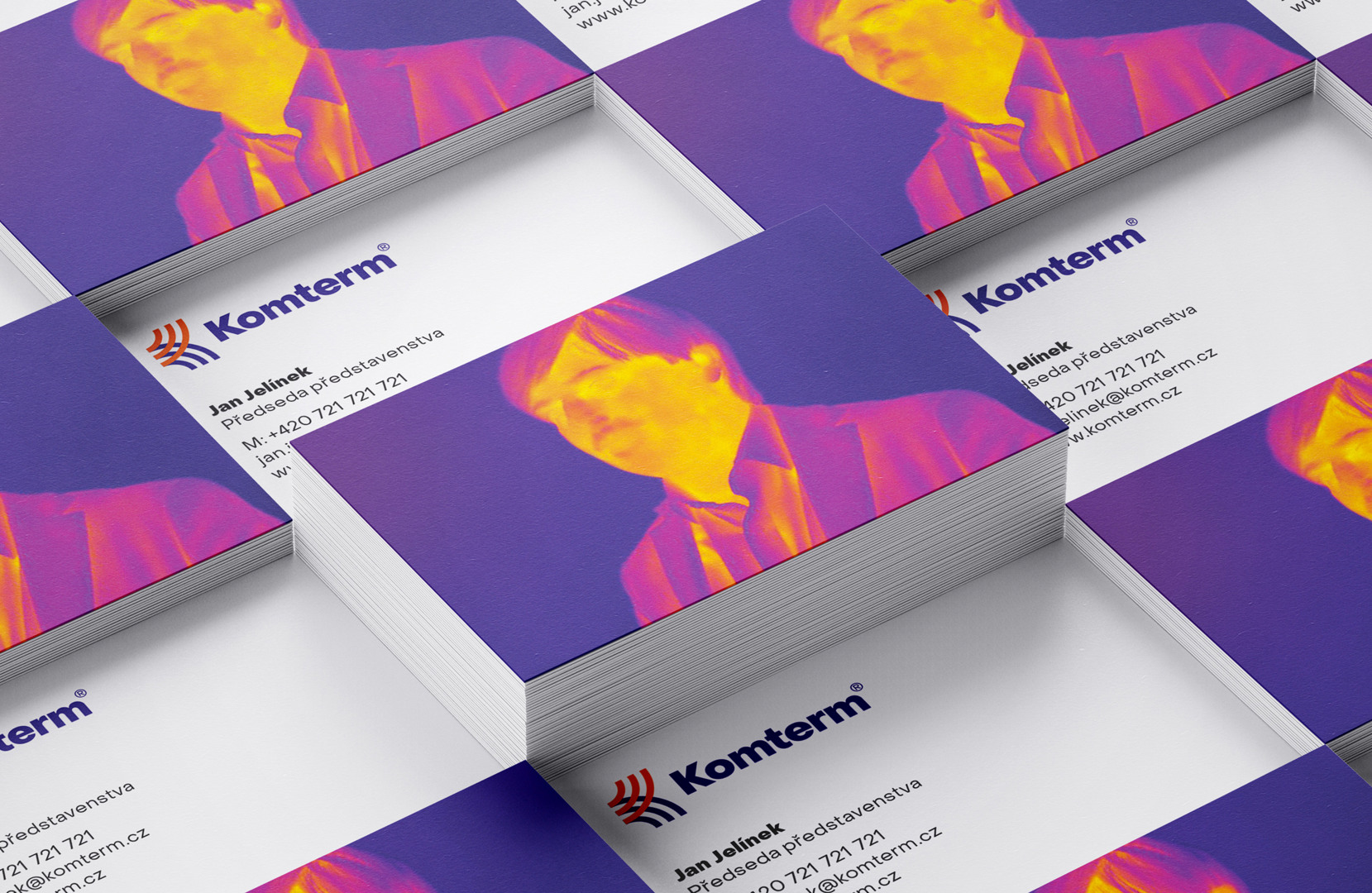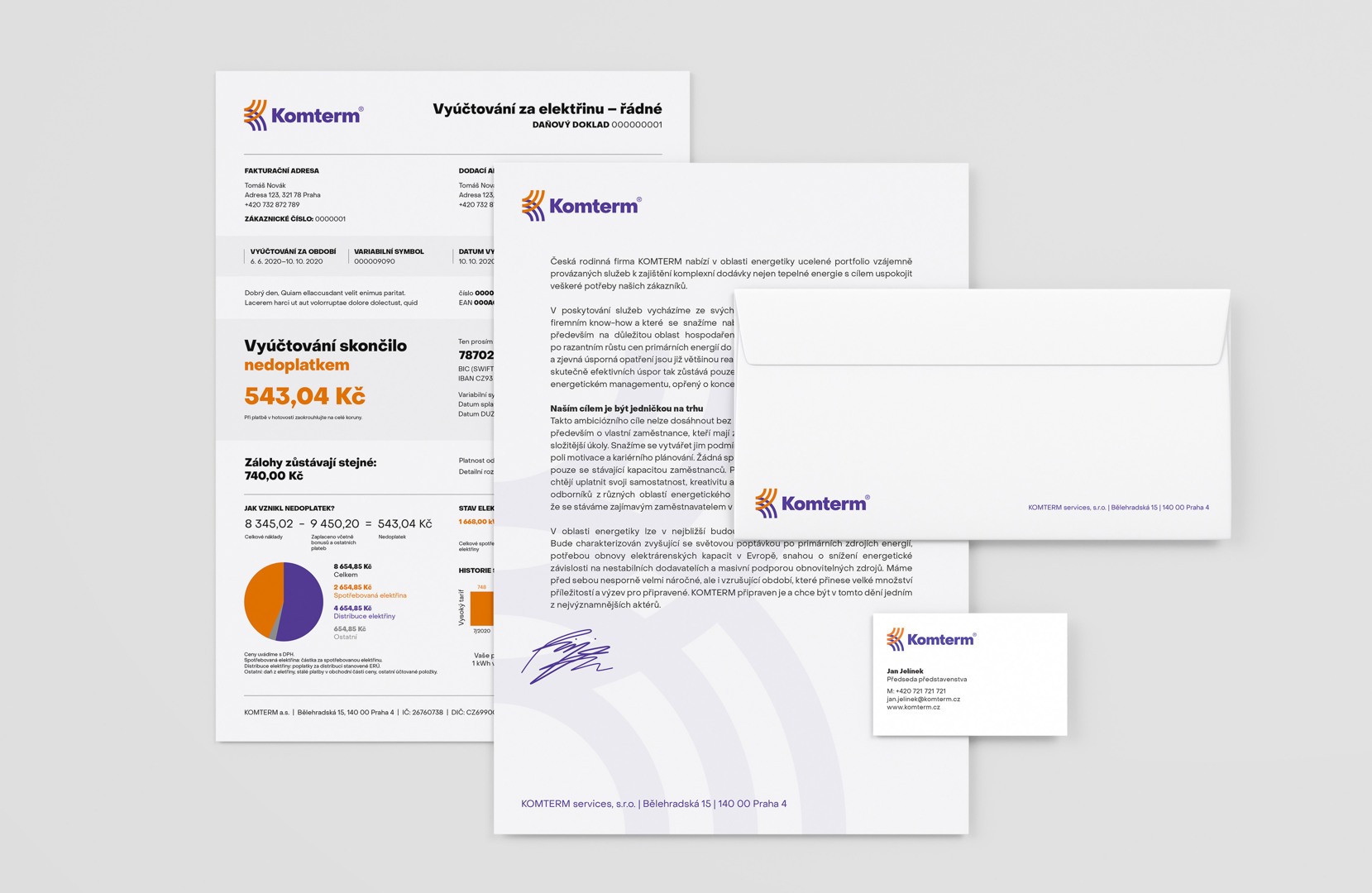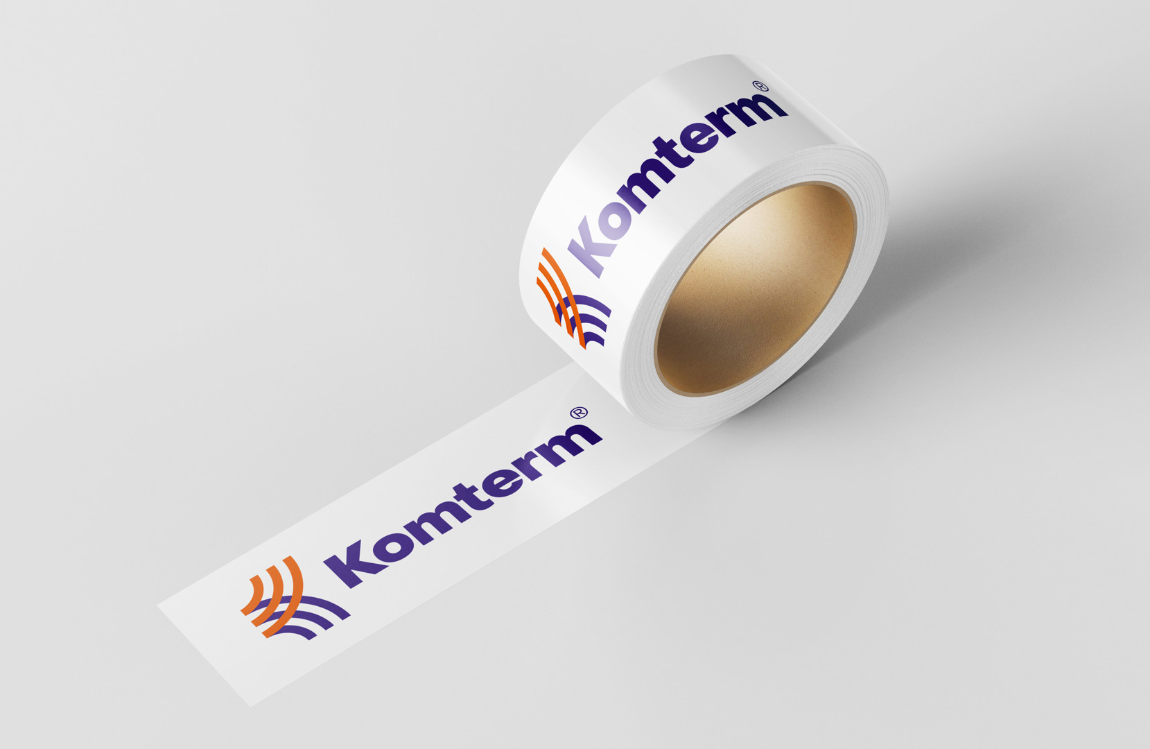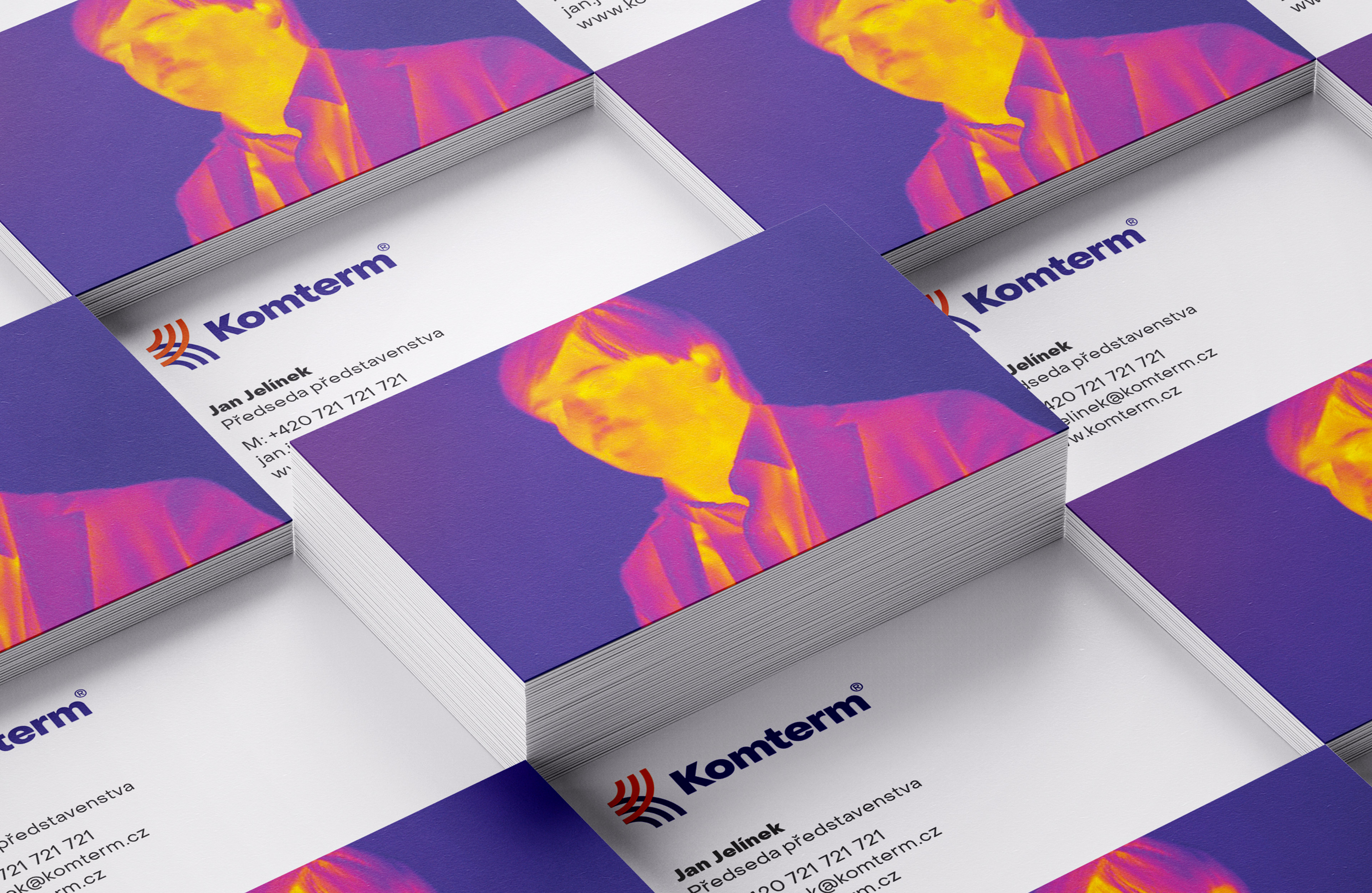
Brand identity and art direction for the energy distribution company Komterm. The symbol is created by streams of hot and cold air running in opposite directions to shape the letter K. The color scheme was inspired by thermographic photography which was actually used for promo pictures and employee portraits.
Client: Wense